Look a little closer
English calls its large and small letterforms uppercase and lowercase because of furniture in an old print shop, not because one shape naturally belongs above the other. When compositors assembled pages from individual pieces of metal type, a widespread arrangement placed the case holding capitals above the case holding small letters. A description of physical location gradually became the name of the letter category itself.
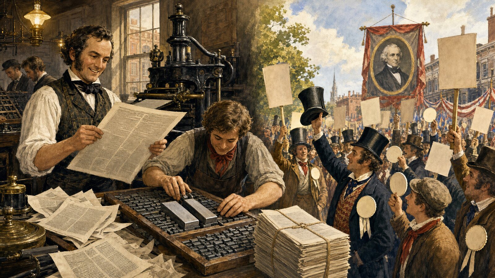
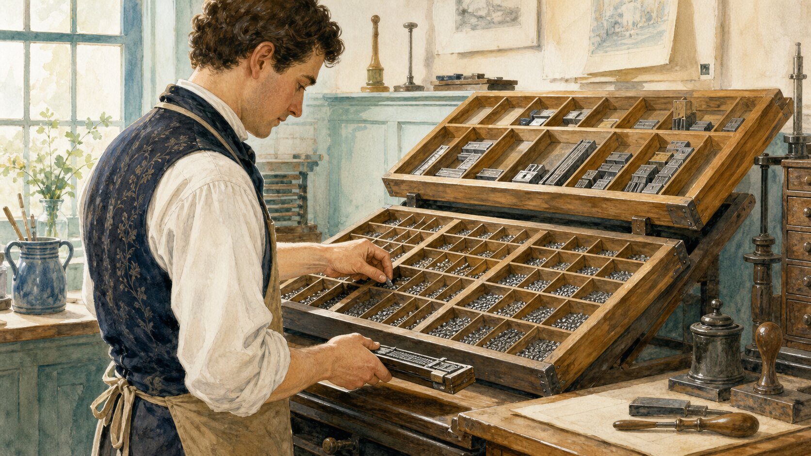
In letterpress printing, each printable character was cast on the end of a small metal block known as a sort. Hundreds or thousands of sorts were stored in shallow, compartmented wooden trays called type cases. A compositor selected them one at a time and arranged them in a handheld composing stick to build lines of text. After printing, the pieces had to be distributed back into the correct compartments. The case was therefore more than storage: its layout functioned like a physical keyboard whose design affected speed and errors.
Where a font was divided between two cases, the distinction was literally vertical. The case containing capitals and certain other sorts stood farther back and higher on a sloping frame. The lower case, positioned closer to the compositor, held the small letters used throughout ordinary prose, along with many spaces and marks. Thus, when a printer referred to upper-case or lower-case type, case meant a heavy wooden tray. It was not originally an abstract grammatical feature.
That origin should not be turned into a claim that every printing shop used one identical arrangement. Case plans differed by country, language, period, and kind of work. Some combined capitals, small letters, figures, and punctuation in a single job case; others separated a font between a pair of cases. Compartments also varied in size and position. The paired arrangement explains the vocabulary, but there was no timeless international layout equivalent to a modern standardized keyboard.
Printing did not invent the two families of letterforms. Monumental Roman capitals and smaller written hands have histories that long predate European movable metal type. Faster pen writing encouraged rounder forms with ascenders and descenders, while medieval scribes refined several minuscule scripts for continuous text. Carolingian minuscule, developed and regularized centuries before Gutenberg, became especially influential. Renaissance scribes and type designers drew on such manuscript traditions when pairing Roman capitals with the small forms that became familiar in print.
Several near-synonyms consequently preserve different histories. Capital derives from a word associated with the head and became connected with prominent letters at the beginning of a section or sentence. Majuscule and minuscule are useful historical and paleographic terms for larger and smaller scripts or letterforms. Uppercase and lowercase, by contrast, preserve a printer's spatial directions. The pairs overlap in modern use, but their origins are not interchangeable explanations of how the shapes themselves evolved.
The unequal compartments visible in surviving type cases reveal another layer of the job. Ordinary text needs far more copies of frequent letters such as e than of rare letters, so equal boxes would waste both space and motion. Compositors memorized a case plan, recognized reversed type faces, and reached rapidly without searching every compartment. Returning one sort to the wrong box could seed a later line with an unexpected character. Behind the simple words upper and lower lay inventory management, muscle memory, and highly practiced handwork.
The wooden cases receded as composition moved through machines, typewriters, phototypesetting, and digital systems, but the vocabulary survived each technological change. Today, software changes case without moving any object. Search tools can be case-sensitive, editors offer a change-case command, and phone keyboards display a shift between letter states. A word that once described a tray's position now names a property of encoded characters and the operations performed on them.
Uppercase and lowercase are therefore small linguistic fossils of manual printing. The letterforms themselves grew out of a much older history of inscription and handwriting, while their everyday English labels remember where compositors reached for metal type. Nothing on a screen rises to an upper shelf when a capital appears. Yet every case command preserves the geometry of a vanished workstation: common small sorts close at hand below, less frequent capitals waiting in the tray above, and a page constructed piece by piece between them.
EDITORIAL RESPONSIBILITY
FactosBrain Editorial Desk
The FactosBrain Editorial Desk researched and reviewed this article under our editorial policy. We assess error reports under our corrections policy.