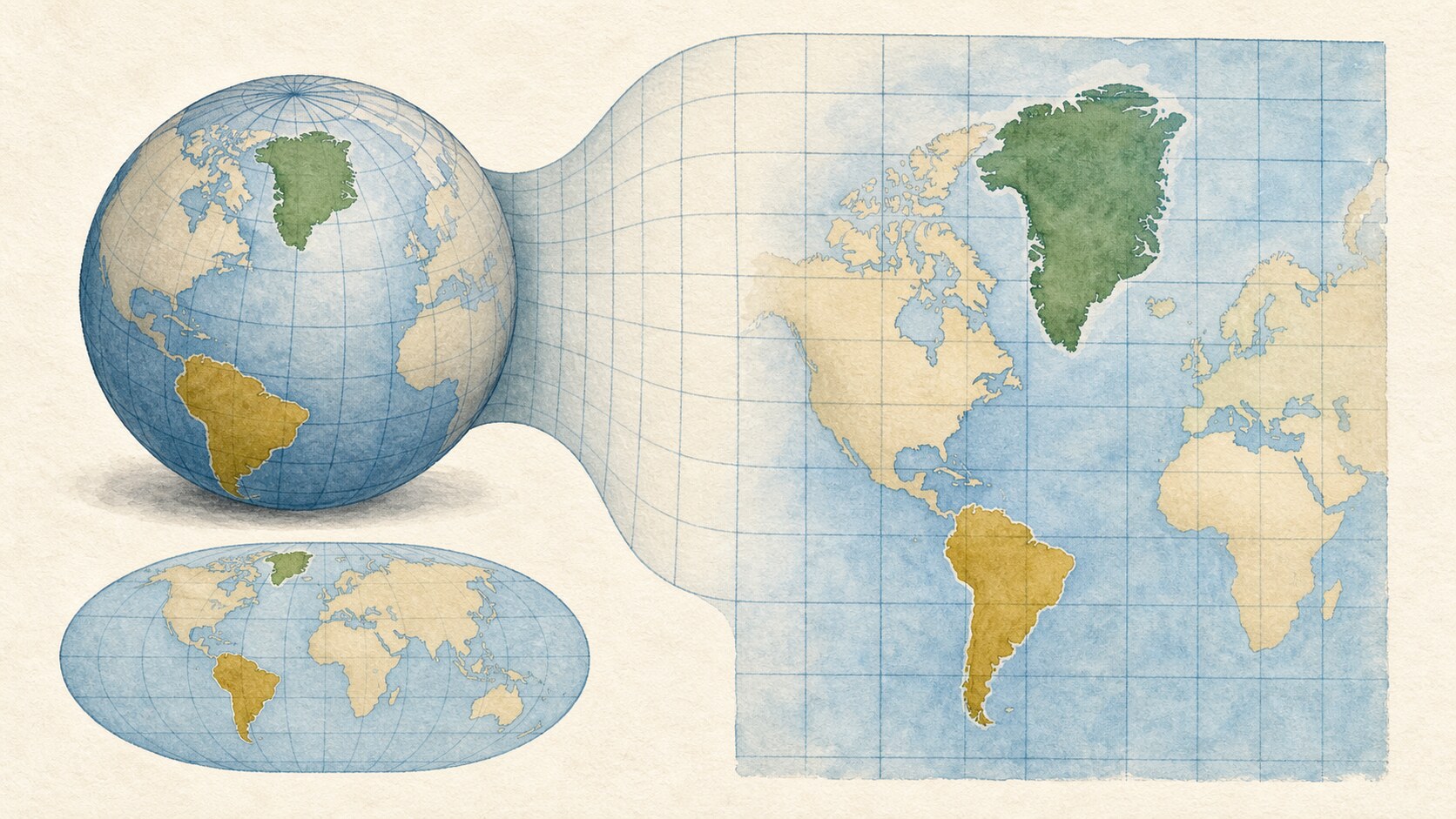
Greenland appears comparable to or larger than South America on many world maps, although South America has more than eight times its area. The mismatch is not a surveying error. Mercator-family projections enlarge high-latitude areas when they transfer a round Earth to a flat surface.
A sphere cannot be flattened without stretching or tearing its surface. Every world map therefore distorts some combination of area, shape, distance and direction. A projection does not eliminate distortion; it chooses which properties to preserve for a particular use.
In the classic Mercator projection, meridians are drawn as equally spaced vertical lines. On the globe they converge toward the poles, so maintaining equal spacing enlarges east-west scale at high latitudes. Preserving local angles and shape requires north-south scale to grow by the same factor, causing area exaggeration to rise with the square of that scale.
Most of Greenland lies at high northern latitudes, while a large share of South America is much closer to the equator. The same real area consequently occupies more map space nearer a pole. Northern Canada and Russia look enlarged for the same reason, while Africa and South America seem relatively smaller.
That does not make classic Mercator useless or simply wrong. Rhumb lines—routes following a constant compass bearing—appear straight, which made the projection valuable for navigation, and it preserves local angles and shapes. It is nevertheless a poor choice for comparing continental areas on a small-scale world map.
EPSG:3857 Web Mercator, common in online maps, is a separate variant optimized for square tiles and convenient zooming. It applies spherical equations to coordinates defined on an ellipsoid, so it is not strictly conformal relative to that ellipsoid and does not preserve rhumb lines exactly. Those differences may be unobtrusive locally, but high-latitude area distortion dominates a world view.
For size comparisons, an equal-area projection or a globe provides a better companion. Equal-area maps introduce different distortions of shape and angle, so there is still no perfect flat world map. Greenland's apparent size is a useful lesson in reading what a projection was designed to preserve—and what it deliberately sacrifices.
EDITORIAL RESPONSIBILITY
FactosBrain Editorial Desk
The FactosBrain Editorial Desk researched and reviewed this article under our editorial policy. We assess error reports under our corrections policy.